The only scientific dispute about climate change is about how future rates of global greenhouse gas emissions will affect future temperatures and we need to reduce emissions significantly and rapidly in order to ensure the long term viability of human life.
The science of greenhouse gas was theorised by Fourrier in 1824. Tyndall demonstrated the effect experimentally in 1859, and the role it plays in the temperature of the atmosphere was expressed by Ekholm in 1901.The only scientific dispute about climate change is about how future rates of global greenhouse gas emissions will affect future temperatures.
The dispute arises because of our uncertainty about how many different physical effects will couple with each other. However, there is no disagreement that we need to reduce emissions significantly and rapidly in order to ensure the long term viability of human life. Some examples of targets for the required rate of reduction are:
- COP 21 meeting in Paris
"It seems to be widely agreed that the richer and more energy intensive nations should cut their emissions to 25% of 1990 levels by 2050." - IPCC AR5 recommendations
- European Union
- UK Climate Change Act
From the developed countries, it isn’t clear that we have any moral justification for saying what should happen in developing countries until we have acted significant ourselves. But taking an average of the above targets, it seems to be widely agreed that the richer and more energy intensive nations should cut their emissions to 25% of 1990 levels by 2050.
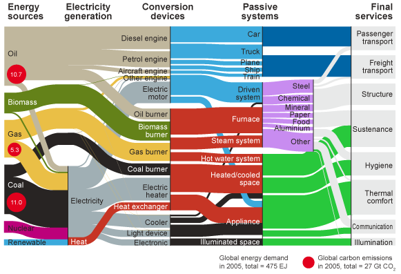
To understand what this means, we need to understand where emissions come from. This question can be answered in many ways: we could create pie charts of global emissions divided by gas, by economic sector, or by the technology that causes the emissions to be released. Figure 1, which we produced for the Intergovernmental Panel on Climate Change’s most recent Assessment Report, connects together seven such pie-charts. Each vertical slice through the diagram could be a separate pie chart. However we’ve connected them together to show how the pie charts relate.
|
"Data farms and lighting are only small contributors to global emissions; heating air and water in buildings and delivering food are the two most important activities" |
The top three quarters of the diagram shows emissions associated with energy and industrial processes. Reading from right to left, the gases themselves are shown first, mainly linked to the three fossil fuels. Oils are refined, and around a third of all fossil fuels are used for electricity generation, to create the forms of energy purchased by users. This energy is converted in devices such as motors, engines and burners to perform useful work, mainly in movement or heating. However the diagram shows a separation between the motor and the equipment in which it’s used; often the motor is very efficient, but the equipment less so. The equipment is operated by sectors which deliver services (including goods and equipment) to final users, shown on the left of the diagram. The bottom quarter of the diagram shows other emissions, dominated by land-use change (deforestation) for growing crops, direct emissions from ruminants, and the methane released when biomass rots as waste.
This form of diagram helps us get a sense of scale about different types of intervention. For example, despite their prominence in popular media stories, data farms and lighting are only small contributors to global emissions; heating air and water in buildings and delivering food are the two most important activities. The diagram also helps check the validity of other statistics and comparisons. Public figures frequently use the words “energy” and “electricity” as if they mean the same – which the diagram clearly shows is untrue. And organisations wanting to promote their own services often combine actions from different slices of the diagram to exaggerate the size of their claims. The marginal abatement curve, which was first applied to carbon dioxide emissions savings in the early 1990s (for example by Jackson (1991)) and is heavily marketed by McKinsey’s consultants, combines elements from many different slices of the diagram as if they could be added up.